Figure/Table Formatting Guide
All figures and tables in your manuscripts must be cited at least once in the main-text of your manuscript. Typically this will occur in your Results section, but can occur in other sections of your manuscript.
You can also cite your figures/tables more than once in your manuscript - in fact, we encourage you to cite them multiple times! When you cite a figure/table in your manuscript you are telling your reader that what you just talked about in a sentence is visually shown/supported by a specific figure or table.
Remember that citing figures and tables should be passive. That means we are looking for the citation to appear at the end of the sentence, in parentheses, much like how you cite your references. We follow this format as it will force you, as an author, to make sure you are telling your readers about your data and what you saw in words rather than just saying “Figure 1 shows the results from our first trial.”
A correct, passive reference to a figure or table would look like this:
“We saw that treatment with NaCl lead to decreased growth compared to treatment with NaHCO3 (Figure 1).”
Tables are generally used to display raw data, compare your data to previously published data and/or explain variables.
Figures are generally used when you want to highlight the relationship between two variables.
If you are choosing between using a table or a figure to show the same data, it is generally better to use only a figure to display the data.
Tables can help display your data in a way that is easily accessible to readers compared to long lists within the text.
When creating a table, here are some items to keep in mind:
Column and Row Titles
What is represented in each row and column? The titles should be clear and concise so a reader can quickly look at your table and understand the data being shown. If you have measurements don’t forget to include the units!
Cell Size
You don’t want the table to appear cramped, so make sure there’s some space within the cells for the text to “breathe”. If you have text within the cells think about how long you want the cell to be, or if wrapping the text in the cell gives a cleaner appearance.
Alignment
Think about if the text in the table should be centered, left or right aligned. You may find that it varies within a table depending on the data in each column. Also think about the vertical alignment of text - do you want it centered, at the bottom, or at the top of each cell?
Shading/Borders
Borders help separate information within cells. Try different border setups to find the one that works best for your data. You may find that having only horizontal borders is better for your data. Having a bolder line separating your column titles from the rest of the data may also enhance table clarity. You can also use shading to help separate rows and columns, but don’t go too overboard with the colors!

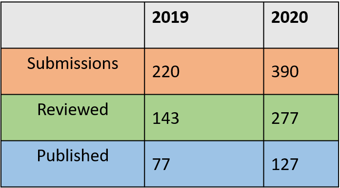
Take a look at the two tables above. Try to see what items mentioned above are done well and which are not in each table.
Figures should act as visual aids that highlight the main findings of your experiments.
If you aren’t sure what your figures should be, think about your experiment and what the main piece(s) of data is/are. Each piece of data should be represented in a figure (or table, if applicable).
Items to consider for each figure:
Labels
Each axis should have a clear label to aid readers in understanding the figure. Be sure to include units at the end in parentheses as needed. Any text on graphs should be at least 12 pt so it can easily be read. Please do not include titles on your graphs. Titles should be located in your figure captions and bolded.
Error Bars
For any data with replicates, data should be graphed with error bars. This tells readers that you collected multiple data points for each condition and also shows the variance within your data. Typically error bars are only in the horizontal (y-axis) direction, but consult with your mentor or an editor if you think you might need them in both directions.
Color Scheme
Using color is a great way to help show your data in figures. When making figures, here are some items to keep in mind relating to color.
Some people are colorblind and can have difficulties differentiating between certain colors. As a general rule, you should avoid using red and green on the same graph as this is the most common type of color blindness. Another step you can take to make your graphs colorblind friendly is to not only use different colors for different conditions, but have different symbols or shading as well.
Keep your color scheme consistent throughout graphs. This means if you graph the same treatment on multiple graphs it should always have the same color/symbol. Likewise, if you have two graphs showing data from unique treatments, the two color schemes should be different.
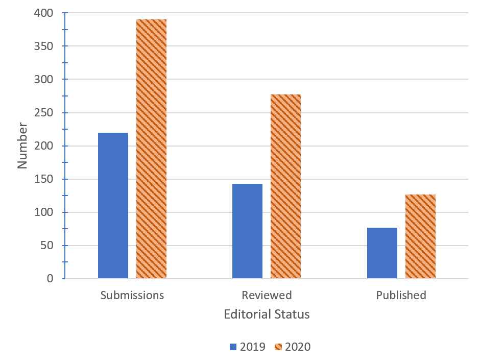
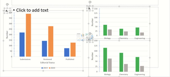
In this example bar graph you can see both axes are clearly labeled. The years are differentiated by color and shading of the bars. Additionally, this is the same data shown in the tables above. Which format is easier to see the differences between the two years? Why?
File Formatting/Size
Figures should be of high enough quality/resolution that when you place them in the Word document of your manuscript they are clear and easy to read. It is always better to make your figures big when putting them together - we can easily size down figures when making the final PDF of your article, but it is very hard to scale up figures and have them look good! Pay particular attention to the font size of any text in your figure. We recommend that you bold any text/labels and use a 14-18 pt font size (we’ll let you know during the review steps if we think this needs to be adjusted any!).
Borders
Please do not use borders with your graphs/figures. They unfortunately do not transfer over well to the final published version of your manuscript. Borders can also cause graphs to look more cramped, especially in paneled figures, it is much easier to read if there is white space around the figure!
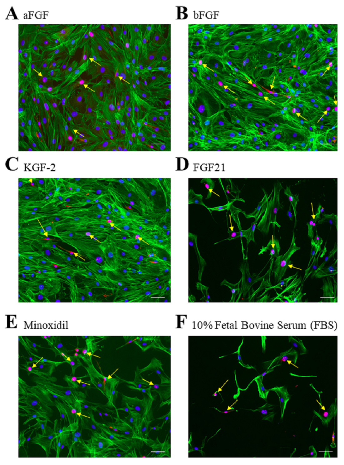
Paneled figures are used when we have data that can’t be put on one graph, but each individual graph shows something similar. Here we walk you through this process in PowerPoint.
- Get all graphs onto a single slide and arrange them in a logical order.
a. Typically you want graphs to have the same y-axis scale so data can easily be compared.
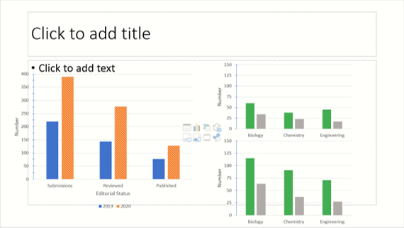
- Place a text box with the panel label (i.e. “A”, “B”, etc.) on the upper left-hand corner by each graph.
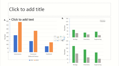
- Once you have everything spaced appropriately, select all individual objects (graphs + labels) by clicking on each while holding “Ctrl” (PC) or “Cmd” (Mac).
-
Click “Group”. Everything should be one image now. You can test this by clicking on it and moving it around. If a figure or label gets left behind it needs to be grouped with everything else!
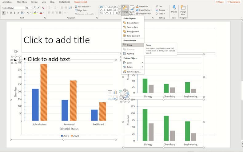
Figure captions provide all the information a reader would need to understand your figure even if they didn’t read the rest of your paper. The basic elements of a figure caption are: title, what is graphed, methods, statistical values (if applicable), and replicates.
Please see the examples below from previously published JEI articles.Single Panel Figure
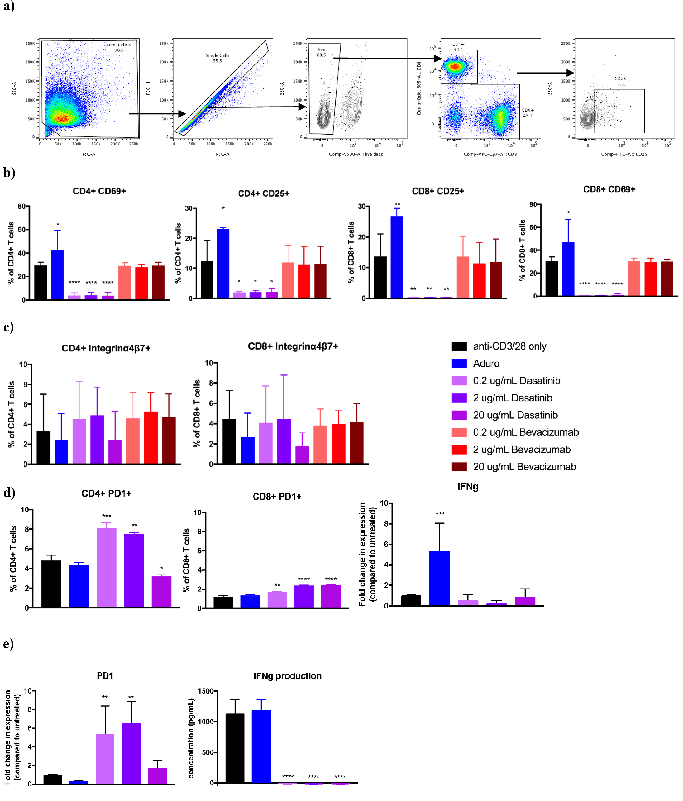
Multi-panel Figure
Note that for both of these examples, all components of the figure are addressed in the caption by placing the panel identifier letter in parentheses before the text describing that panel.
In any MicrosoftOffice application you can right click on the figure and select “Save as Image”. We recommend saving files as .TIFF or .JPEG.
Typically figures that are previously published cannot be used in your manuscript due to copyright laws (and often they are not necessary to include!).
If, after discussions with our editorial team, it is decided that a previously published figure would significantly enhance your manuscript then you would need to get the following permissions for publication. You would have to contact the journal where the figure was originally published to receive their permission which often involves also getting the permission of the original authors. Documentation of this permission would need to be sent to JEI for our own records that we can legally republish the figure in question.
You should not indicate where you want your figures placed in the main text of your manuscript by saying something like “Place Figure 1 here”. As the formatting of this file is different than the Word file we use during the review process (i.e., it has two text columns) places indicated by authors do not often work out.
Our editors who make the final typeset PDF of your manuscript for publication will place figures and tables while balancing the look and readability of the final PDF with getting figures/tables placed as near to the in-text mention as possible. You will always get to review the PDF before it is posted and can give input on figure and table placement, but please know it is not always possible to move figures and tables around - our editors will discuss this with you should it come up.